
Artist Talk: Be Sargent
Be Sargent delivered this Artist Talk at ART123 Gallery on April 23, 2024.
What I love about the markers is that you can draw with them. My use of color has a lot to do with drawing. Rather than make the space with color I make the space with colored lines and shapes. From then on it is, “do I like it?” “Do I like it?” is tinged with “do I dare?”
Because there are a thousand rules to break that cover every place on the canvas. The middle, the corners, the sides, the top the bottom. You are always in some defined, scary area that could destroy the whole.
So you just go along willy nilly and suddenly the colors start to relate to each other. There is nothing you can do about it. They are there. Each is light or dark, each is warm or cool, each has its own intensity.
Now your eyes really take over. As each color fills your eye, your eye automatically looks for its complement, its opposite. So if you have green and no red your eye will add red where ever it can. It will make a yellow more orange, blue more purple and a beige more pink. Your paints will look different.
That’s what you see and believe and use.
With shapes perhaps there is more of your brain involved. You see images. Mostly I get rid of them especially in the early stages, wanting color to say everything. Sometimes an image is so lovely and nests quietly, I can leave it.
So now you have a working tapestry. I take my work from the studio into the house so it can torture me after hours. Sometimes upside down. And I love to look at the work just as it is getting light in the morning or dark in the evening when the lights and darks are predominant and the cools recede and sometimes turn white.
Matisse told a fellow artist, I think Derain, at this time of evening onset. “It’s happening, it’s happening!”
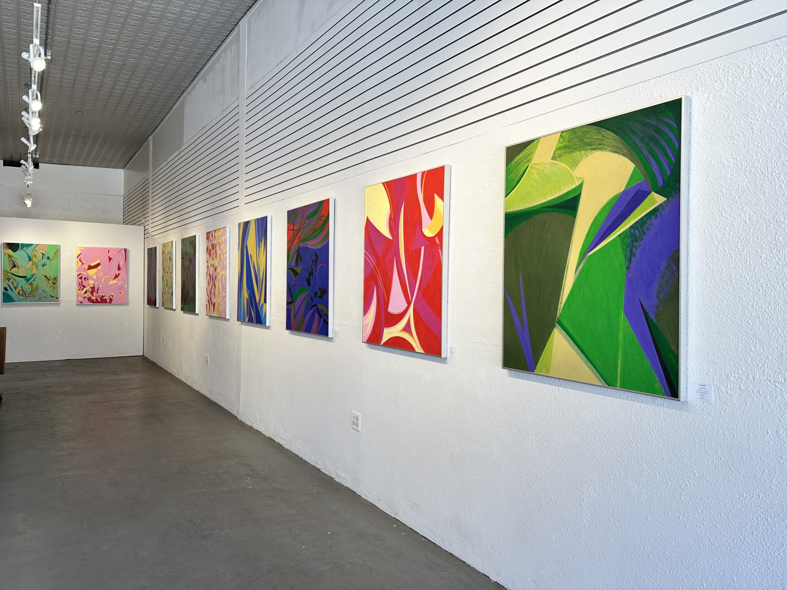
Anyway, let’s look at the work. We’ll just look at ten.
Starting with Sharp. Amazing that these two big greens can both be read as green. The purple is controlling the greens.
But secretly, the little yellow green is controlling the purple.

This red one which followed the other reds was obviously in response to Rd saying, “give me a chance you have just been using me as a triangle!”
I let Red dominate but I was mean because I let Yellow do something even more exciting which was to let her touch all the other colors. And you see what a hard ball she became where red is still just a backdrop.

This is the third blue. Full of imagery. Bats flying to the moon. Clouds overhead. Sea creatures below. Sometimes colors just want to be things.

Blue Boy is the oldest–November 2022. I don’t think I could have gotten this effect with anything but the marker and the lovely paper surface of the gatorboard. And here is where I have to read what I found on the net…
“Gatorboard is an extremely rigid lightweight composite display board which combines excellent strength to weight values and versatility with archival quality which allows its use for display mounting of museum artifacts and materials requiring a non-acidic environment.”

This red and yellow one I love for the two purpley pinks and the way they overlap. Notice that the yellow is never allowed to touch the red. This size piece usually takes a week but all the work doesn’t show because the medium is so opaque that I can go over everything and back to zero any time.

This one, I just wanted to see how differently I could use the RGB, red, green, blue, and I only put it in the show because we needed the purple. It’s definitely what my friend would disparaginglycall “a floral.”

This is the fourth of the green series. I am now working on number six, a big one. I definitely am in love with these colors. And speaking of beige reading as pink, somehow a beige being pink in your eye is more exciting than actual red and white.

And this oneI think is really the best of the ten. Just concentrating on letting each color sing. As an exercise, try to see the red as white and you will see how difficult it is to tell how dark red really is.

And this early red and yellow is just about making a funny shape a Respectable Siamese House Twin Doublewide floating in a pink sea. I guess that yellow is touching red, too, but it’s not very effective.

And here is the first of the green series. Yolanda Travers saw a face in it and I was horrified but there was nothing I could do but make the face nicer. More people liked this piece than any other.
